

Let’s talk about bulletins.
While there is a digital shift that will likely phase out bulletins completely in the coming decades, the bulletin remains the strongest communication tool for your active parishioners.
For this reason, it’s important to take the bulletin seriously, with the readers experience in mind.
Too often, parish bulletins are messy, disjointed, and generally do a poor job reflecting the importance and beauty of parish life.
Inevitably on Monday morning, the parish secretary (we’ll call her “Ingrid”) will get bombarded with last minute requests for ads to somehow fit into the already too full bulletin. Ingrid will get random e-mails with Word docs about blood drives, bake sales, and prayer groups that no one attends. The docs will be full pages, consisting of mostly blank space, with random colors, fonts and cute cartoons.
Of course, Ingrid is a wizard so she finds a way to squeeze and smush all of that information into the beloved bulletin — unless Ingrid is having a bad day… then she just ignores it and says, “you missed the deadline.”
Week after week, month after month, year after year, this is the process of creating your most important communication tool.
We will make the argument that, if you want your bulletin to actually matter, this chaos needs order — and we’re going to show you how.
If you implement these suggestions, it will undoubtedly make your bulletin more impactful and (dare we say) beautiful.
Here goes:
1. Don’t use clip art — ever.
Use real photos. Ideally, you can have regular photos of parish life displayed in your bulletin. If you don’t have a photographer on staff, find folks from the parish who will be willing to cover events. They are out there, you just have to ask.
(Pro tip: If you need high quality photos and don’t know where to look, you can use a source like Unsplash.com, where all the photos are free to use.)
2. Only use 2 Fonts (or 3 if you’re feeling dangerous).
Generally speaking, we suggest having the following:
-
- a simple, clean primary font for all of your headlines/titles/paragraphs (ie. Poppins),
- a font for formal announcements, or to contrast your primary font (ie. Crimson),
- and using a complementary formal or script font (ie. Script). You can also find more great, simple and clean fonts for free using Google Fonts and DaFont.
3. Create a color scheme.
The best way to do this is to find a few complimentary colors. You can use a free tool like Adore Color (select complimentary) if you need help coming up with the right theme. Other than using real photos, additional colors for backgrounds, headers, or fonts should be limited to your color scheme.
(Pro tip: As a general rule, people prefer to read dark text on a light background, so it’s best to lay off making your font colors another black or dark grey.)
4. Move the contact information to the back of the bulletin.
Think of the bulletin as a newspaper or a magazine. The most important information to highlight is displayed first, and the less important content is put to the back. While needing to get staff contact information is important at times, the regular reader will rarely, if ever, going to need to know the email for the maintenance guy.
In fact, most parishioners will likely never need to know how to contact anyone on your staff. And if they do, they’ll go to your website or already have the e-mail saved in their web contacts.
So, the contact information is unhelpful, ugly to see, and not useful, often displayed in the “prime bulletin real estate” (the front!) of the bulletin.
(Pro tip: Create contact postcards with your mass times, and leave them on the table in your lobby)
5. Create a master template — and funnel the content into that template.
This might be the most important tip for creating an efficient process that leads to better bulletin. This Sunday, pick up your bulletin and you will likely see a bunch of randomly placed blurbs and flyers, that don’t match, don’t fit, and frankly look bad. You read it but you don’t like to look at it.
The way to fix this is to have one master template, and when most of the information is ready to into the bulletin, if falls into a pre-made design so everything is unified. Of course, you’ll get certain PDFs that can’t be adjusted, or maybe are well designed and don’t need to change. That should be the exception, but that’s it.
Those lovely prayer ladies and the eager promotors of upcoming events should be told to send their content as text only, not as final designs. Pre-determine how much space can be allocated to particular people/groups/ministries, and plug in their information into the template.
This will save everyone time and will unquestionably look better when it is placed within an organized, orderly layout.
6. Redesign Your Cover.
It’s the first impression, like a first date.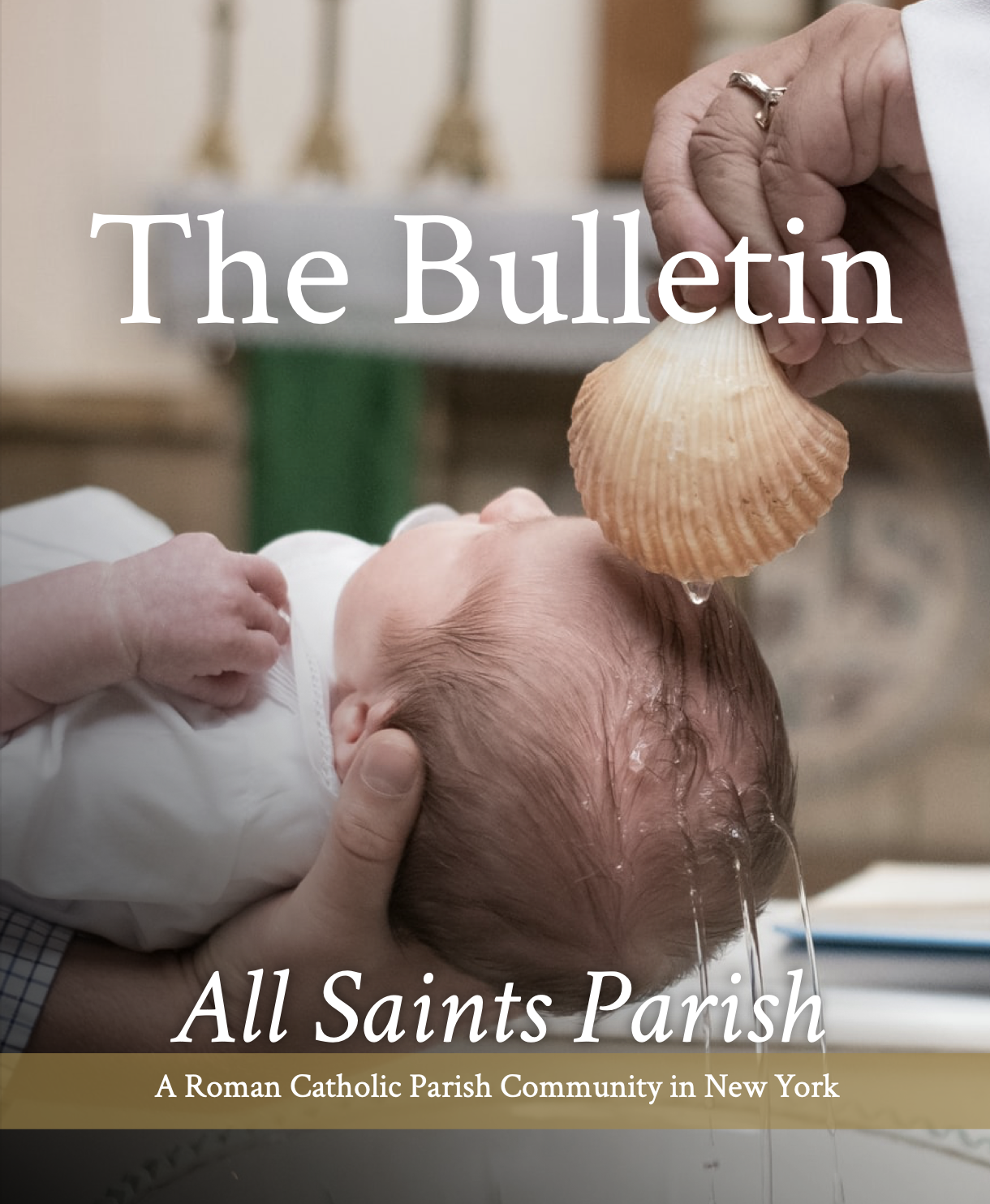
If you don’t like what you see, you’re just going to hope it has a good personality. After a while, you’re going to stop picking her…ehem…”it” up (too far?). The same principle applies. Imagine if the cover was so beautiful, or powerful, or meaningful, you needed to pick it up. You’re drawn in to it, or it moves you.
There is unlimited amounts of sacred art, or inspiring photos that you can use that are in the public domain. Thankfully, with the liturgical calendar, you can map out all of your covers in advance.
(Pro tip: Nothing replaces real, high quality photos of YOUR parish community)
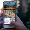
7. Convert your bulletin into a Mass program.
For many churches, the Covid pandemic forced us to remove our missalettes from the pews. In some cases, the missalettes have not returned. That’s not necessarily a bad think though. We’ve seen parishes revitalize the value of the bulletin by converting it into a worship aid. So, folks are grabbing a bulletin on the way in – as if they are going to a broadway play. It means the bulletin “matters” to them.
If you put your songs and readings in the bulletin, not only will it save the parish a few bucks, congregants will be more inclined to pick up the bulletin, use it, and look through it.
8. Utilize your website and social media instead.
This seems like a no-brainer but very often parish websites and social media is not being used to communicate information. You get to decide what is important and only the important information should be going into your bulletin.
Everything else can be placed on the website so it doesn’t waste space. In fact, a slimmer, relevant bulletin is better than a cluttered, meaningless bulletin.
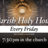
9. Create a buzz with the bulletin.
Bulletins tend to be very predictable. You know there will be mass intentions, prayers for the military, perhaps a letter from the pastor “from his desk.” (oof!). If you add some spice to what is regular in your bulletin, you’ll give people something to be excited about and it communicates that you’re trying to think outside the box.
Take a step back to ask yourself this question: What is something that is so compelling that people will look forward to the bulletin each week?
A reader in the pews will flip through your glorious 10-page masterpiece wondering, “how does this matter to me?” The way you answer those questions is by making sure every bulletin has something that will inspire, entertain, inform, and reflect the community.
Here are things that we’ve seen to offer a few suggestions:
-
- Include regular, high quality photos capturing weekly parish events
- Feature children from the parish on the cover
- Hide items in the bulletin for kids (think Where’s Waldo, but with saints, religious items, etc.)
- Highlight inspiring stories of people in the parish that have had encounters with Christ
These 8 tips are crucial if you are looking to immediately improve your bulletin. Once you are able to implement them, you’ll be on a track for a great path forward for your parish community.
Then, all you need to do is rinse, wash and repeat…as long as Ingrid lets you!
How well is your parish utilizing the bulletin? Did we miss something?
Let us know: info@startupcatholic.org.